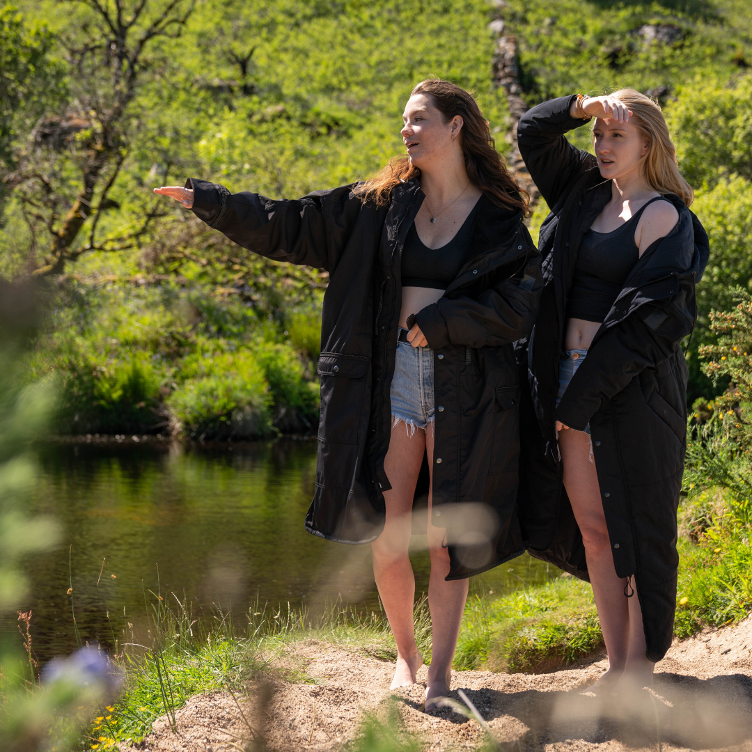
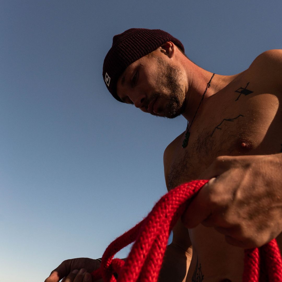
We often get asked, how did you come up the brand name, Ryde?
It's a weird one really.
It all started with a nickname, metaphor and an acronym. Which sounds a bit like one of those jokes when you have 3 different characters walk into a bar.
Metaphor: Life is a journey. Along for the ride. Ride or die. Life is a rollercoaster, just gotta ride it - okay the last one is Ronan Keating.
Nickname: My (Larnia) second name is Ryder. With a first name like Larnia, I have also been waiting patiently for Netflix to hook me up with a Chronicles of Larnia travel series (🤞) but whilst they're preparing their offer - I also didn't want the brand to be associated with the big yellow transport Ryder vans. Ryde was a nickname granted to me in school by my friends (amongst others 😂) .
Acronym: In the grips of the pandemic, I had the task of getting a rather prompt flight home from Australia. I'd been there for a few weeks 'networking' for what was starting to become a living, breathing brand rather than scribbles in a notepad. 18 hours into the journey, I flicked through one of those onboard magazines tucked behind the airplane menu and the safety instructions.

Somewhere in between discovering Dubai's Street Style, I saw a line of text 'Reach Your Destination Easily.'
Sh*t.
My jetlagged brain focused on the letters.
R.Y.D.E.
That was the moment it all come together.
Logo development
So I had a brand name that meant something to me and something in time, I hoped would mean something to others. It was a small, simple word that encouraged others on a journey - alluding to the idea of having a helping hand, or a type of companion which I wanted to be our products. Now I needed create a logo.
The scribble stage
I call this 'the scribble stage.'

I love all of these logos and in time, will produce t-shirts with more of a vintage feel but it didn't feel right. I wanted something different, more modern - something holistic, that nodded towards the technical nature of Ryde outerwear.
Yin & Yang
I've always been very interested in the yin and yang concept. The positioning is yin (rational) and branding is yang (emotional). They're two sides of the same coin, and you need both.

With this in mind, the brands next milestone moment was the Jurassic Coast, the South West England Coastal Path that has very literally, been shaped by the shore. Author Raynor Winn describes the setting far better than I ever could:
"On a basic level, maybe all of us on the path were the same; perhaps we were all looking for something. Looking back, looking forward or just looking for something that was missing. Drawn to the edge, a strip of wilderness where we could be free to let the answers come, or not, to find a way of accepting life, our life, whatever that was. Were we searching this narrow margin between the land and the sea for another way of being, becoming edgelanders along the way. Stuck between one world and the next. Walking a thin line between tame and wild, lost and found, life and death. At the edge of existence.”
I loved the shaped by the shore concept. Like yin and yang, the waves shaped the shore. The shore shapes the waves.

So I kept it simple. The lettering forms a wave. The wave alludes to the journey. The positioning is circular, like yin and yang. Like the seasons. Whatever the weather, whatever the occasion.
Another nice thing about the simplistic design is that it's more eco friendly, there's less intricacy, less ink, less waste - you name it. So there we go. That's the Ryde journey. There’s obviously always more inspiration, people and places that influenced along the way but that's us in a nutshell. Looking forward to having you along with us.
